Reports

What is the Top 500 Live Listings Report about?

The Top 500 Live Listings Report is literally a list of the top 500 ranked product listings for any search query according to eBay’s search and sort algorithm called Best Match.

Best Match is an important part of selling on eBay.

eBay monitors buyer behaviour and preferences to assess and predict a product listing’s relevance and desirability for purchase. When a buyer searches for a product, all product listings are brought together and ranked in order of the most relevant and most likely to make a sale at the top of the search results from #1 onward.

The fact that most eBay purchases occur within the first page of Search Results (the top 50 product listings) suggests that Best Match is a pretty smart algorithm for predicting, and suggesting, the right product match for that online shopper.

Seasoned eBay sellers know how critical it is to monitor their listings’ rank and work towards securing the top of the search results page in order to achieve sales momentum.

The Top 500 Live Listings Report is designed to help eBay Sellers understand what eBay’s AI powered algorithm thinks are in-demand products for a particular search term, category or seller.  

By running a Top 500 Live Listings Report for a search term, category or seller, you will be able to analyse the share of search results. Identify dominant competitors, products and product features or brands.

Use the filters to isolate the data to the top 50 and watch product prices zoom into a range that has the most buyer interest. The top 50 represents page 1 of search results where most sales are actually made.

By working with the report, you could spot emerging trends in buyer behaviour.  Compare competing products and uncover how customers are choosing one over the other.


Explore the data and see where it takes you.

<Return back to Help

What is the Supply Demand Report about?

Identify supply gap opportunities with proven sales. 

The report came about whilst researching product opportunities for large sellers and brands.  They were interested in understanding how their products and brands stacked up against the wider inventory mix available on eBay.

The analysis kept returning a common scenario that although there is a lot of supply within the lower priced generics, there was much less inventory in the mid to higher priced branded products.  Yet actual sales data showed that mid to higher priced goods often had higher sales velocity.

The Supply Demand report is a really good way for finding supply gaps, testing product ideas and learning about buyer preferences for a product, category or brand.

 There can be a lot of light-bulb moments with the Supply Demand Report.  Try it out and explore the data to see where it takes you.

 <Return back to Help

Top 500 Live Listings Report Glossary

The Top 500 Live Listings report is a live market report for eBay’s top 500 Best Match listings for any keyword or category. This report is great for insight into how eBay is merchandising products at what price points to buyers right now. Assess seller and brand dominance of search results. Spot trending product features as ranked by Best Match.

Below is a quick walk through and glossary for the metrics provided in the Top 500 Live Listings report.

FAQ_Top 500_Glossary.png

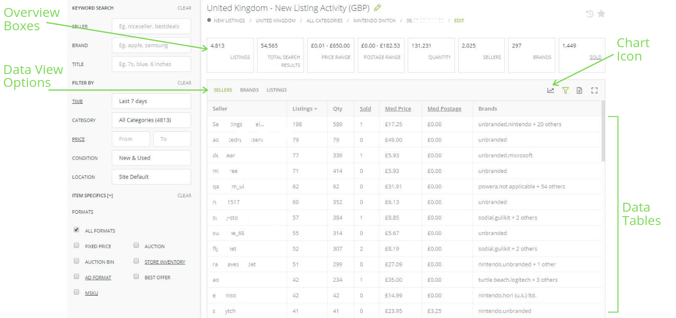
Overview Boxes

Overview boxes give a summary of the data set. The definitions of each metric are:

  • Listings: A count of listings within the data set.  In this report there will be a maximum of 500.

  • Total Search Results: Total number of listings that could be relevant to your search, of which for this report, we only present the top 500.

  • Price Range: The range of prices being offered within the 500 listings.

  • Postage Range: The range of Postage/Shipping costs being offered within the 500 listings.

  • Quantity: Total current stock levels for the 500 listings.

  • Sellers: Number of sellers that the 500 listings belong to.

  • Brands: Number of brands being offered within the 500 listings.

  • Sold: The number of items sold over the entire lifetime of the listings, from listing start date to present, for the 500 listings. This sold number resets to zero if the listing is ended and relisted.


Data Tables

Data is presented in an easy to use tabular format with 3 distinct data view options:

  1. Seller view

  2. Brand view, and

  3. Listings view. 

Click the headers of the data tables to sort. The data column definitions are:

  • Seller: The seller’s eBay ID

  • Listings: Number of listings.

  • Top Rank: Highest ranked listing. This is the default sort for this report.

  • Qty: Quantity of stock available.

  • Sold: The number of items sold over the entire lifetime of the listings, from listing start date to present, for the 500 listings. This sold number resets to zero if the listing is ended and relisted.

  • Med Price: The median price. The price that falls in the middle of the range for that seller or brand.

  • Med Postage: The median postage cost. The postage cost that falls in the middle of the range for that seller or brand.

  • Brands: A snapshot of the brands on offer from the Seller.


Charts

To access the charts, click on the chart icon located at the top right of the data tables. 

In the Live Listings Report there the following charts:

  1. Box plot charts for price and postage to show the distribution of listings across the ranges.

  2. Donut charts with drop down options to visualise comparative dominance.

Charts.png

The Supply Demand Report Glossary

The Supply Demand report is designed to help you spot supply gap opportunities on eBay where there is proven sales and demand. The default table view gives you granular information at the seller, brand and listing level, but you should go straight through to the Data Visualisation Charts to see how current eBay inventory being distributed across different price ranges.

Below is a walk through and glossary of key metrics for the Supply Demand report.

FAQ_SDR_Glossary.png

Overview Boxes

Overview boxes summarise the data set. The definitions of each metric are:

  • Listings: A count of the listings within the data set.

  • Avg #Sold/Week: The average number of products sold per week per listing.

  • Avg $Sold/Week: The average sales value achieved each week per listing.

  • Total #Sold/Week: The total number of items sold each week for the listings in the data set.

  • Total $Sold/Week: The total value of items sold each week for the listings in the data set.


Data Tables

Data is presented in an easy to use tabular format with 3 distinct data view options:

  1. Seller view

  2. Brand view, and

  3. Listings view. 

Click the headers of the data table to sort. Here are the definitions for the data column as seen in the Seller view:

  • Listings: count of listings for that seller.

  • Qty: Quantity of stock available at the time that the report is run.

  • Sold: Total quantity sold by the listings included in the data set.

  • #sold/wk: Average quantity sold per week over the duration of the listing.

  • Med Price: The median price. After sorting the sold prices in order, the median price is the number in the middle of the list (or an average of the two middle numbers if the dataset is even).

  • $sold/wk: Average sales value sold per week over the duration of the listing.    


Charts

Charts visually summarise the data set, including any filters that have been applied. To see the Supply Demand graph, click the chart icon located at the top right of the data table.

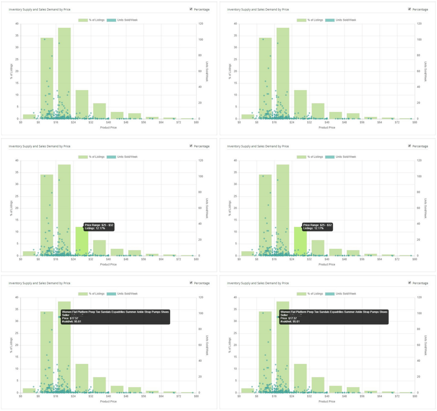
 The Supply Demand graph uses a bar chart to show the percent of listings in each price bracket. It uses a scatter plot (dots) to show the individual listing’s average weekly sales volume.

  •  If you hover over a bar or dot, notations of metrics will appear.

  •  Clicking on a dot will open a new tab for that eBay listing.

  •  If you cannot see the whole graph on your screen, click the Hide Header button in the right frame. It looks like the 4-corners of a square.

Chart_SDR.gif

New Listings Report Glossary

The New Listings report offers a summary of new or re-listed eBay listings up to the last 7 days. This report offers insight into the new products and brands coming onto the marketplace and early warning of a flood of new inventory that could threaten your price point and sales. Run the report for your competitor to assess their latest inventory investment or uncover their category expansion plans.

Below is a walk through and glossary of the main components of the New Listings report.

FAQ_New Listings_Glossary.png

Overview Boxes

Overview boxes summarise the data set. The definitions of each metric are:

  • Listings: A count of listings in the data set.  Report summaries and calculations are based on those listings.

  • Total Search Results: The total number of search results returned for your search, of which in the New Listings Report only includes the newest of those listings up to the past 1 week.

  • Price Range: The range of prices being offered.

  • Postage Range: The range of Postage/Shipping costs being offered.

  • Quantity: Inventory stock levels currently available.

  • Sellers: Number of sellers where new listings have come from

  • Brands: Number of brands being offered within the new listings

  • Sold: Items sold within the lifetime of the multi-quantity listings new listings.


Data Tables

Data is presented in an easy to use tabular format with 3 distinct data view options:

  • Seller view

  • Brand view, and

  • Listings view.

Click on the table headers to sort the data. The data column definitions are:

  • Seller: The seller’s eBay ID

  • Listings: Count of listings.

  • Qty: Quantity of stock available.

  • Sold: Total quantity sold - which for a new listing could show early signs of demand.

  • Med Price: Median price is the middle price within the range for that seller or brand.

  • Med Postage: Median postage is the middle postage price within the range for that seller or brand.

  • Brands: A snapshot of the brands on offer from the Seller.


Charts

To access the charts, click on the chart icon located at the top right of the data table.  Charts visually summarise the data set, including any filters that have been applied. There are charts for:

In the Live Listings Report there the following charts:

  1. Box plot charts for price and postage to show the distribution of listings across the ranges.

  2. Donut charts to visualise comparative values - click on the green text in the chart header to select dimension.

Charts.png